Sonic System
Design system
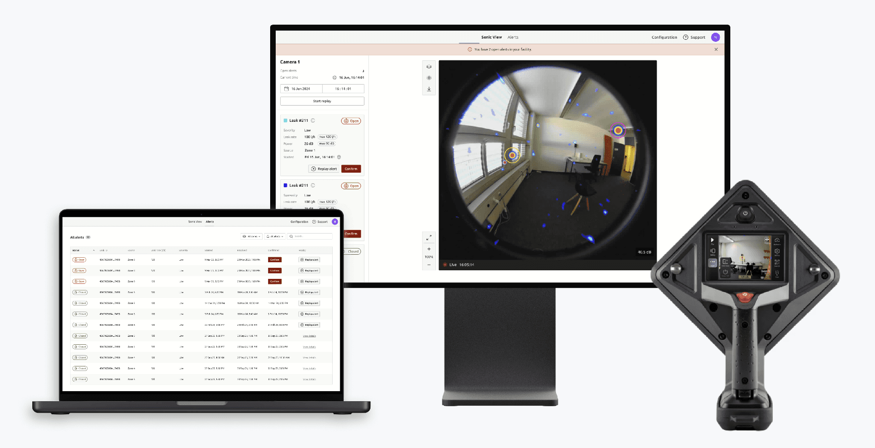
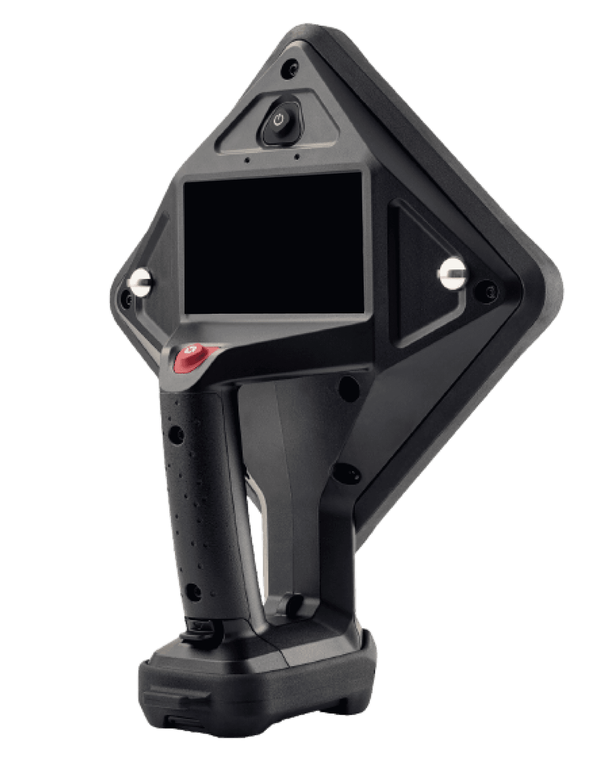
Sonic System is a design system for Distran's Ultra Pro and Fixed Detector cameras, created to help designers & developers in the client's team improve their work process and build products more efficiently. With a consistent design language in place, proper resources and guidance, it becomes easier to deliver high quality products at scale. The design system lays the foundation for Distran's current and future products.


THE Goal
Lacking brand consistency and product guidelines caused inconsistent quality delivered across teams and misleading communication. Our goal was to provide a solution that will help us scale our work efficiency and consistency to all teams and products, providing the necessary guidance to onboard colleagues.
I interviewed different people what they hope to achieve through the design system.
UX Designer
Difficulty to Illustrate to client what their request would look like. A design file with components and layouts available would speed up the process of creating a conceptual mockup.
Software developer
A consistent library of assets that sets a visible standard helps built consistent products and receive design guidelines and requirements for implementation, so implementation doesn't follow wrong design assumptions.
CTO
Reducing redundant design cycles and working more structured and efficiently within an organised system saves time and cost and eliminates time spent on repetitive research.
Team Lead
Product iterations can be more informed, mockups can be build quicker and design information can be collaboratively shared accross the team to make sure everyone knows what to expect.
User Needs & the situation
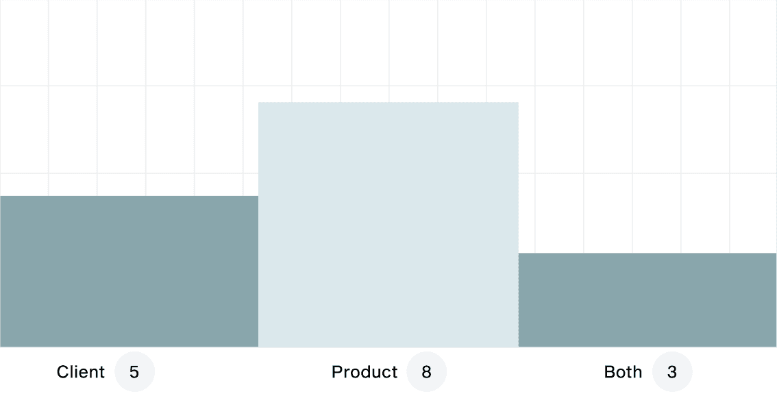
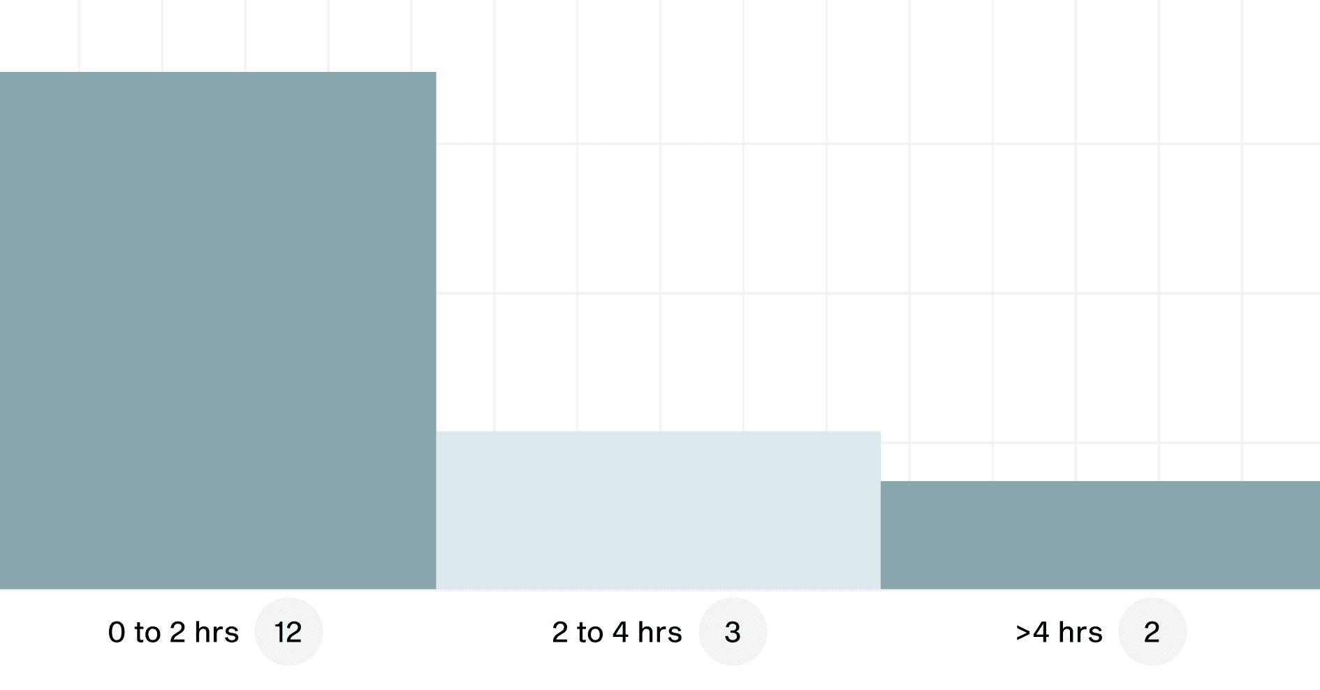
This research phase was a good start point which gave us more perspective of the team, its work methodologies, pain points during projects, analysis of time consumption, and previous experience using libraries or systems.
working for product or client?
Used a design system before?
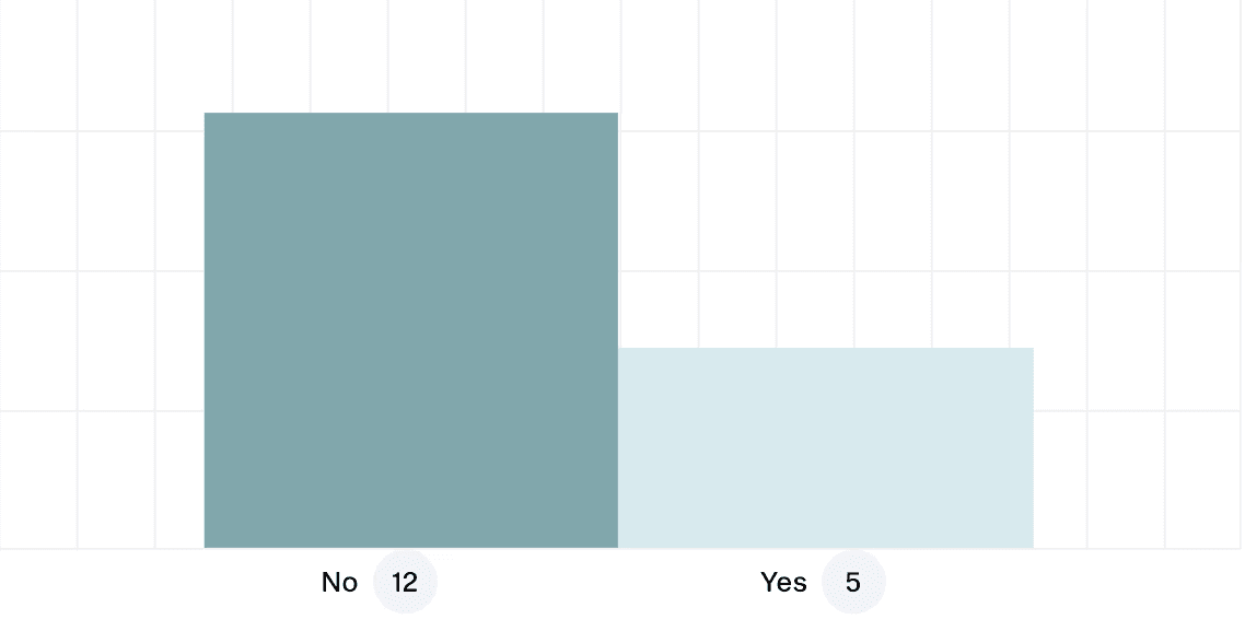
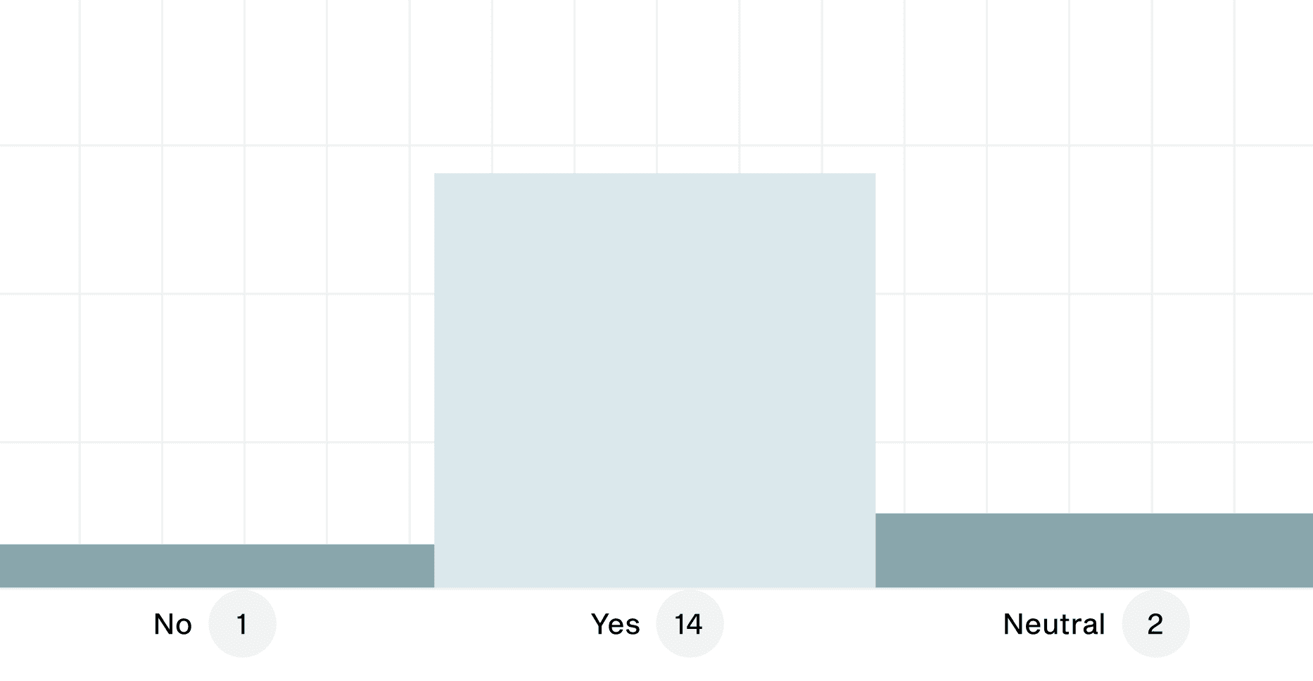
Would a DS help your work process?
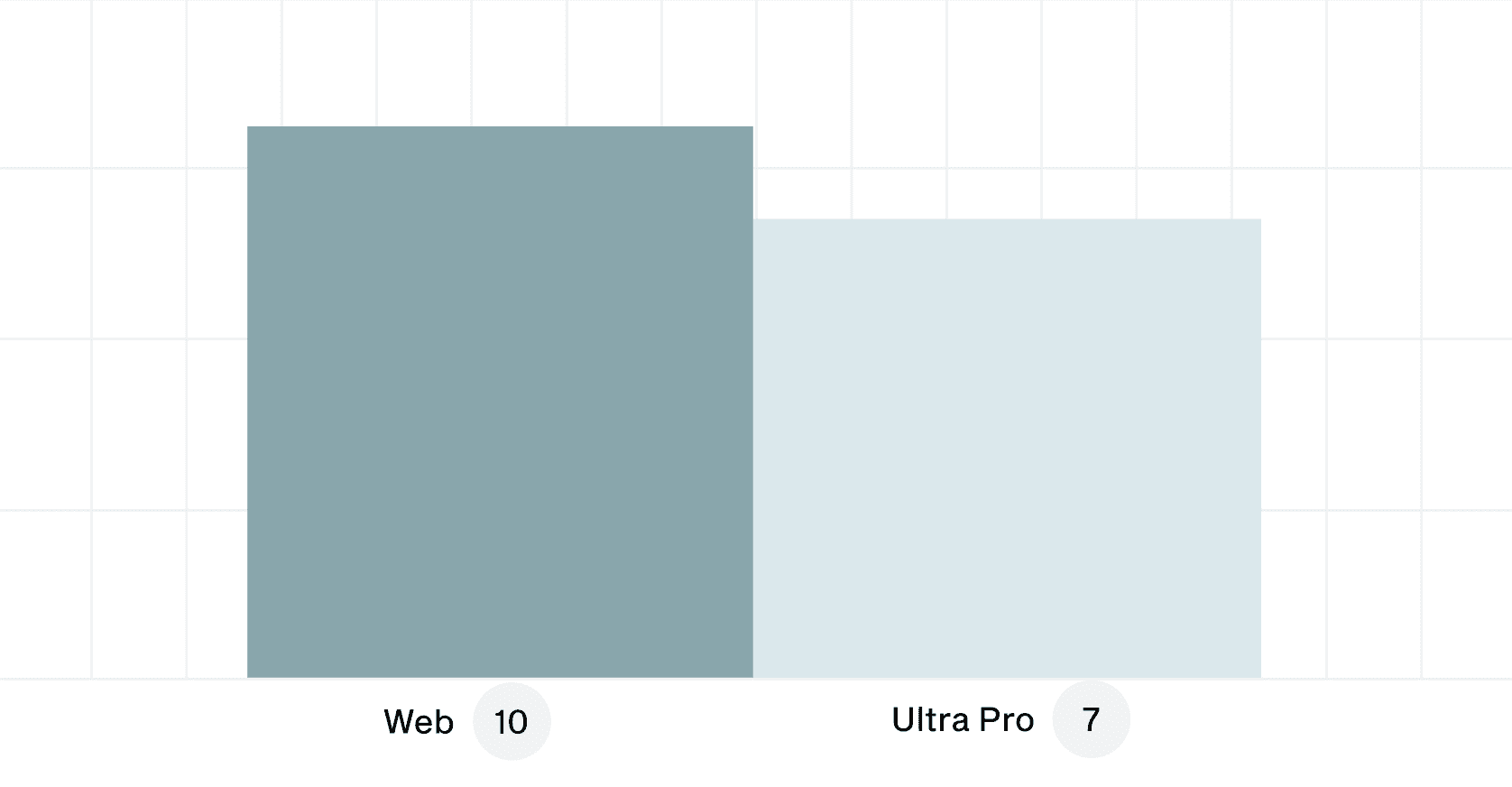
Most demanded platforms in project?
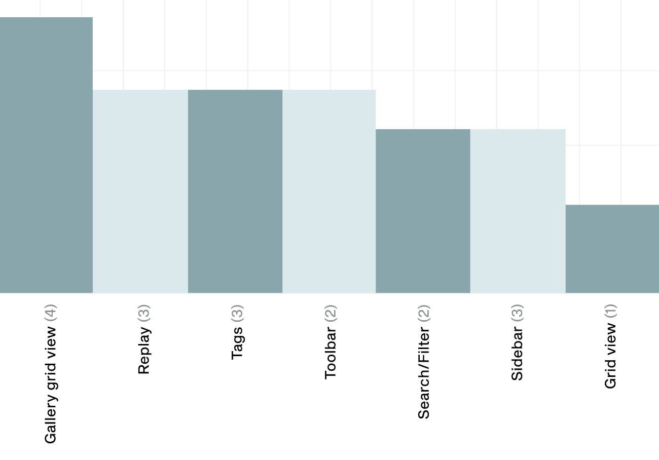
Screens that take most time in projects?
Most demanded platforms in project?
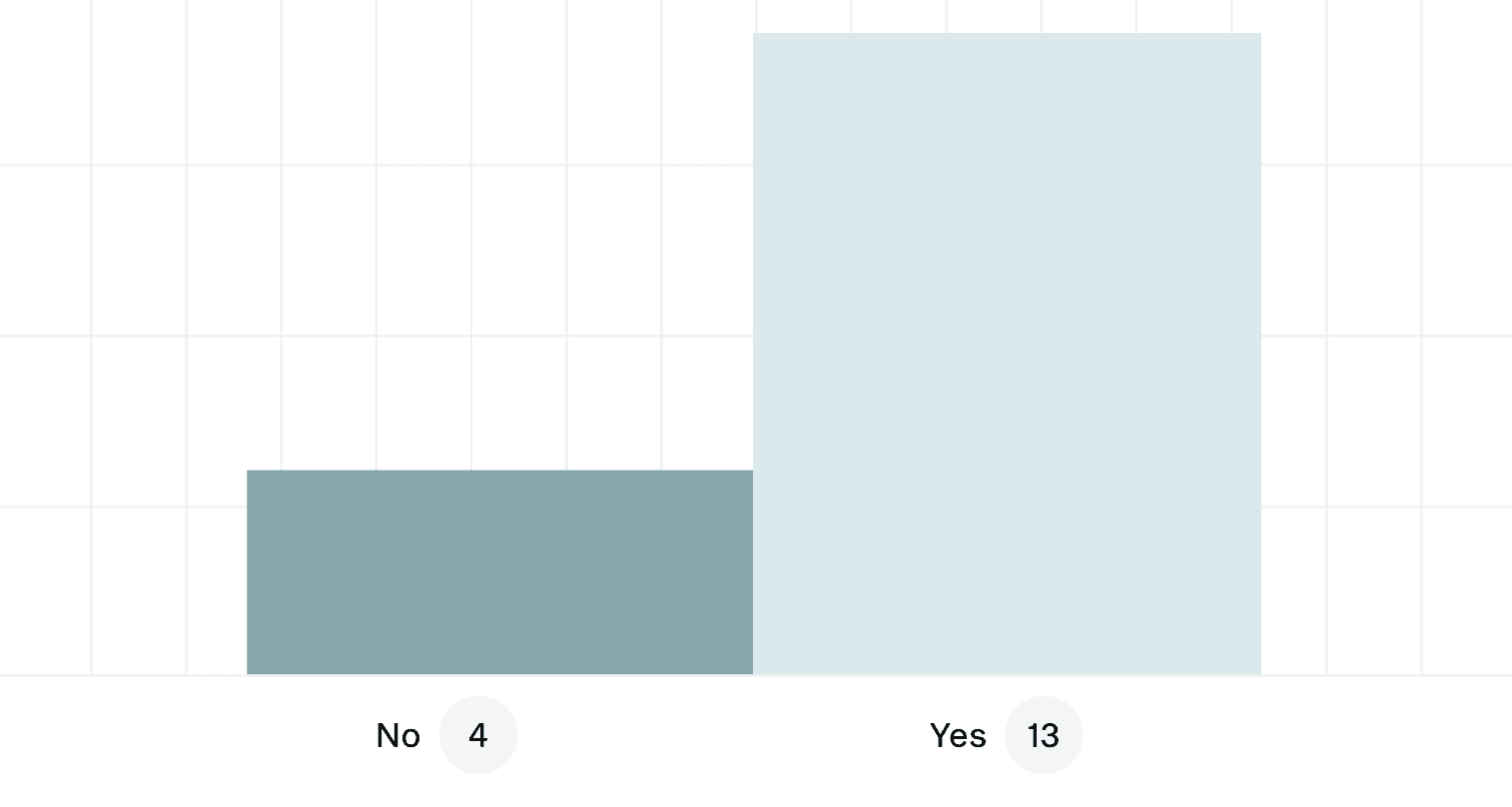
Time per week writing documentation?
System definition
Defining the design system
While with the Fixed Detector Web UI we could start almost from scratch with components, colours and types, it was more challenging for the Ultra Pro interface who already had an established design used by customers. We needed to recreate and extend the camera design without loosing the familiarity of the product to its users.
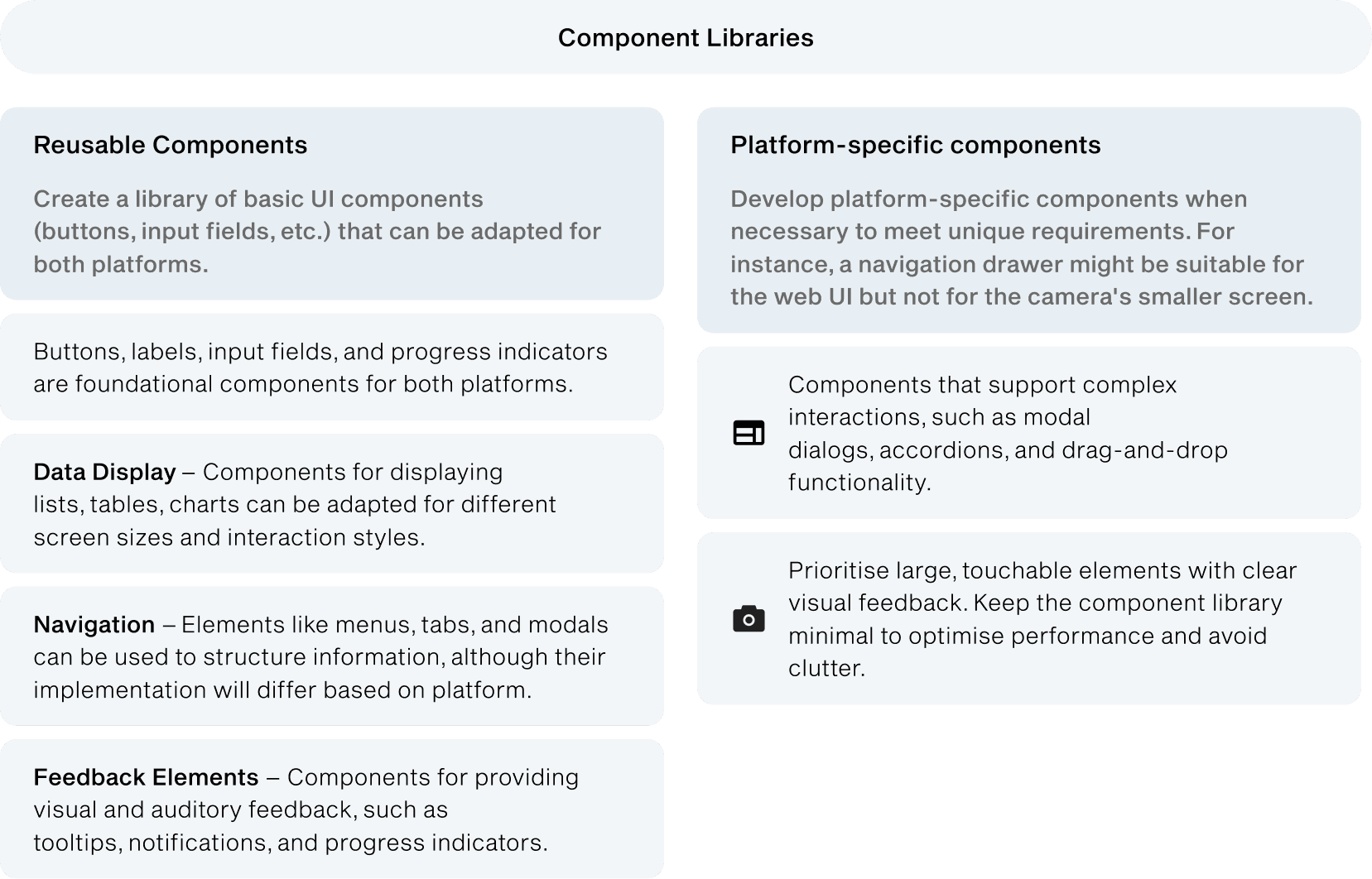
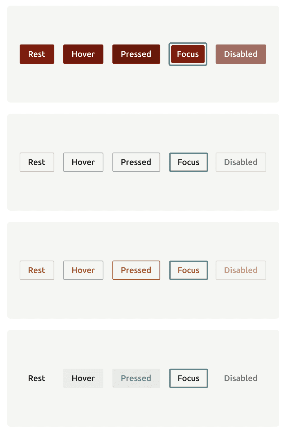
Components will Initially be released & documented inside Figma. Components and patterns will be implemented with storybook to build the UI components. While we initially started our design system in Notion, the need for design-specific features and seamless integration with design and dev tools such as Storybook made us switch to Figma. Figma allowed us to standardise styles, variables, and components. Our component library contains the building blocks of each product. This includes individual components, layouts, templates, and interaction patterns.
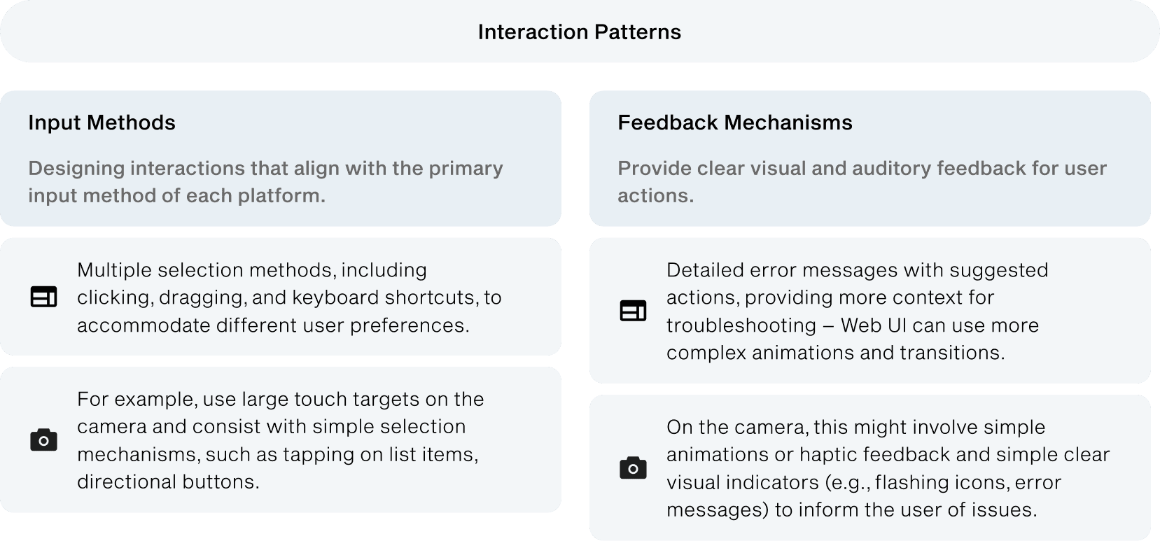
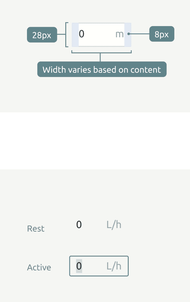
Our components are dynamic and can be adapted according to the needs of our users. Designing for both web and embedded systems like the Ultra Pro camera presents unique challenges such as establishing core visual and interaction patterns that can be adapted to both platforms, recognizing the limitations and strengths of each platform and designing the different input methods.
Design process
Libraries design process
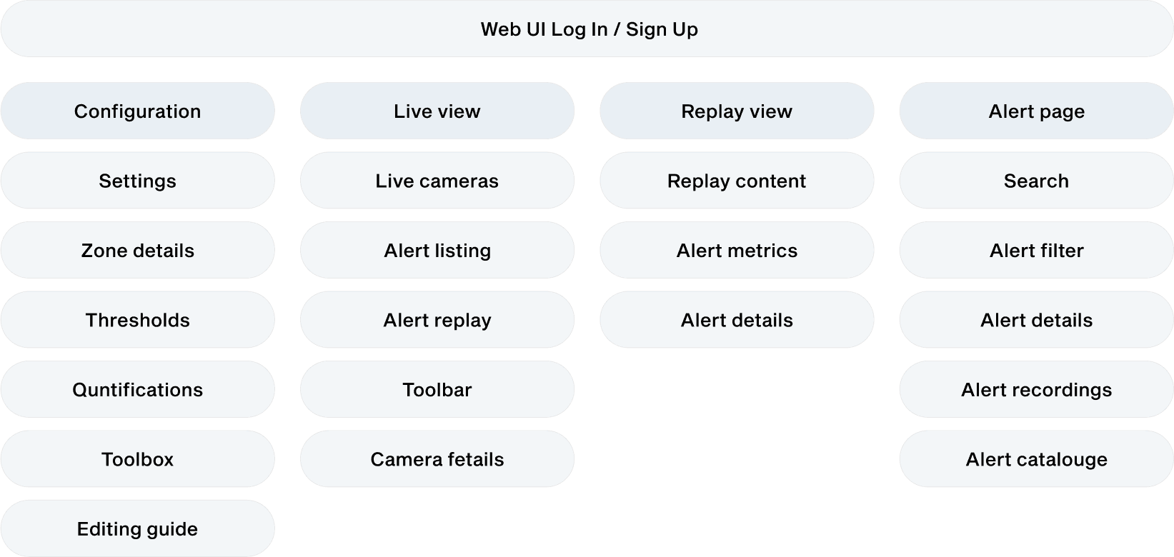
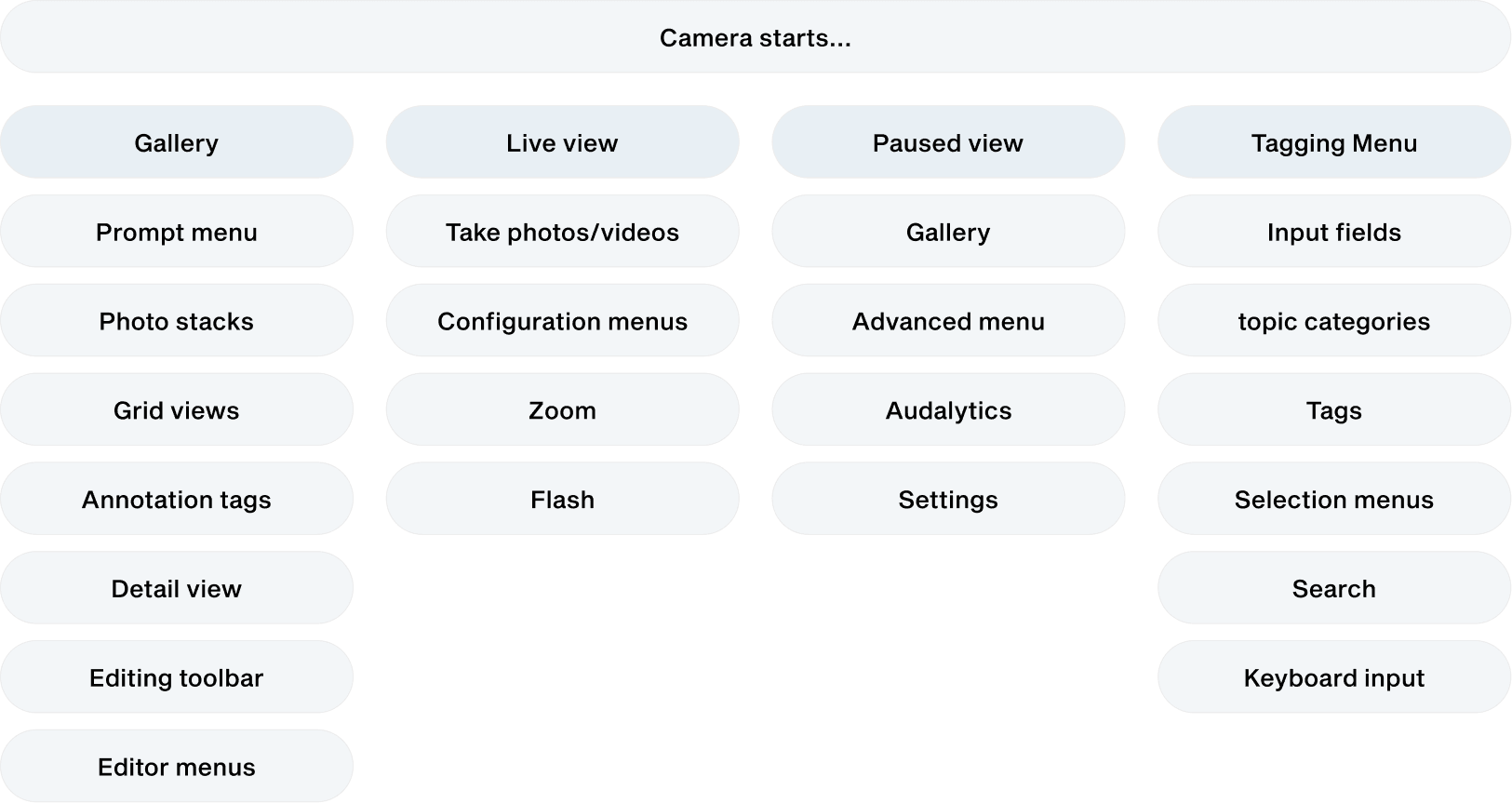
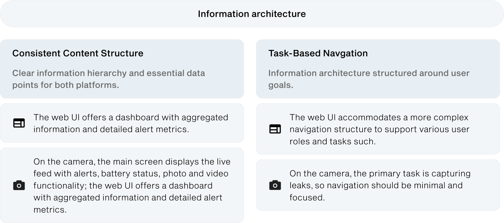
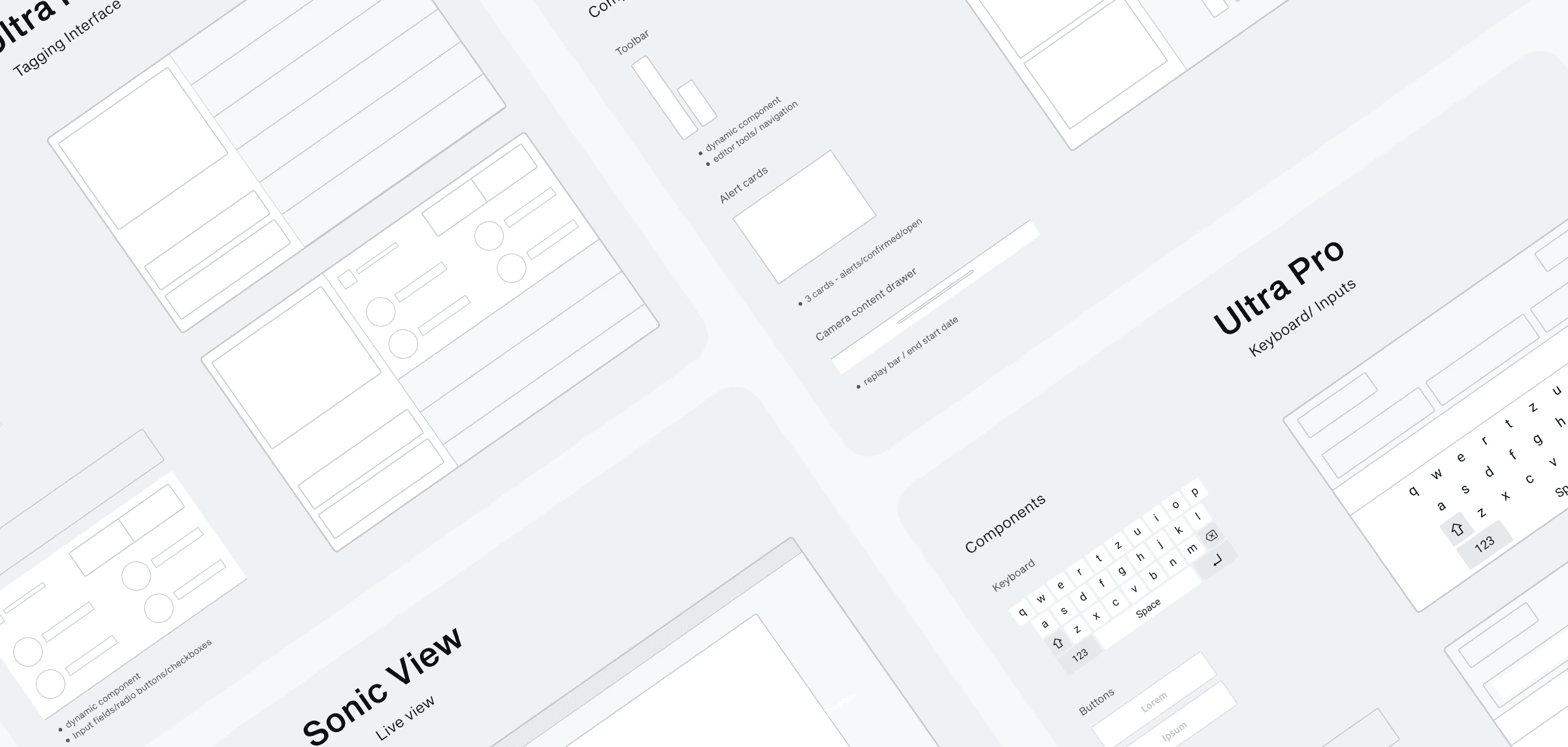
Before starting any design, we first had to define both products and then extract the components and patterns needed for each platform. The first step was thinking the Information Architecture through with the team. We then wireframed the screens of the app for each platform to then identify and list all the components and patterns in it. After reviewing and approving with the team the wireframes and findings, we discussed the best structure and workflows within Figma.
System definition
Anatomy of a component library
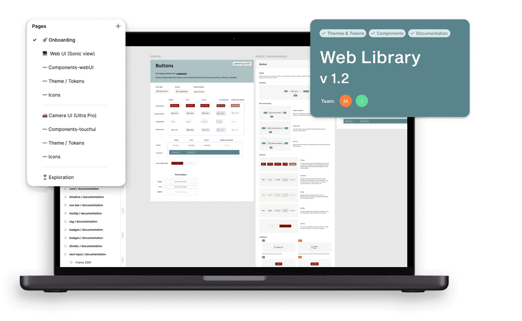
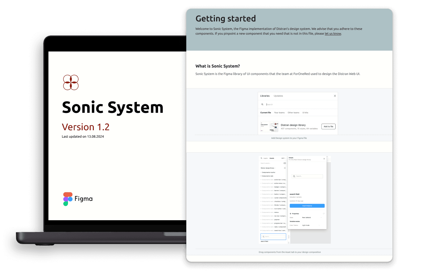
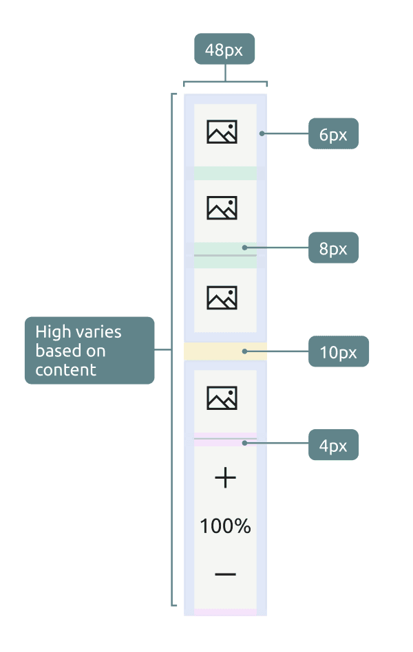
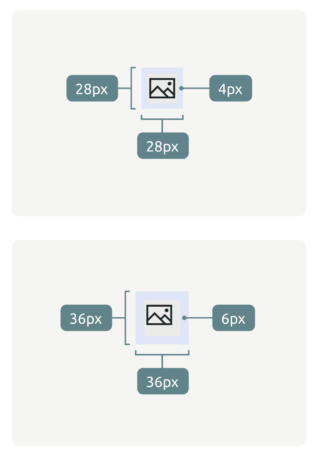
To improve component libraries usage, we agreed the following structure: Cover indicating platform it belongs to, showing version, team working on it and status. Getting Started guidelines for designers & developers that want to use it. Theme / Tokens with corresponding documentation. Designed and Documented Components & Patterns including tips and relevant usage guidance. Exploration area with new components that might be in process.
To facilitate the design system adoption we created the following team structure inside Figma: Onboarding for designers & developers with examples and guidelines; Workflows on the design system and its usage. Products containing each a component library and use case examples. Exploration & analysis area where we store ideas, in progress designs and feedback related to the design system's implementation and usage.
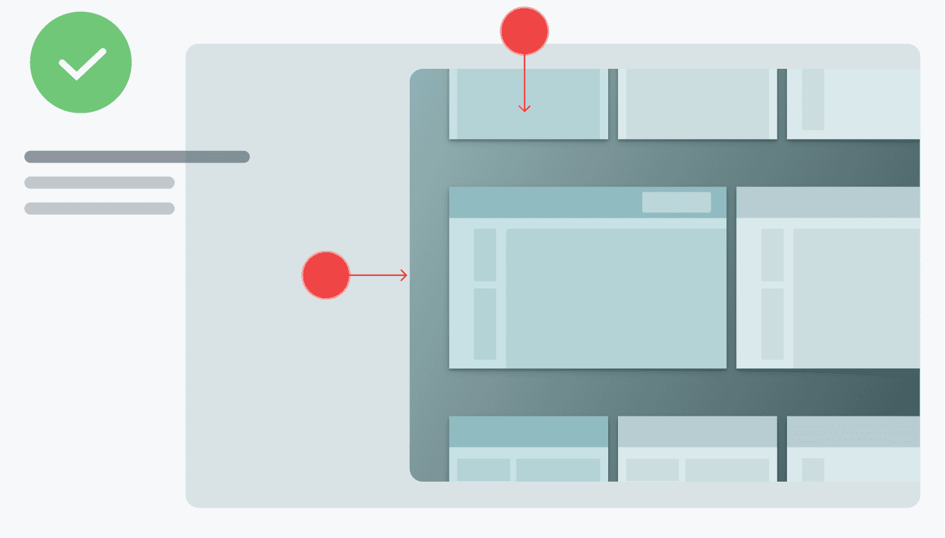
Dynamic design & grid systems. We put special emphasis on making every aspect of it dynamic to enable fluid design. Grid systems are also provided to guide our users when adapting components to different resolutions.
Protoypes
Design System Demo's
By establishing a robust design system with shared components, styles, and guidelines, consistency is maintained while accommodating platform-specific conventions and user expectations. This approach ensures a seamless transition between devices and enables a cohesive user experience across platforms. Below is a selection of prototypes from the Web UI that demonstrates how the DS works and how it can be used.
impact & Next sTEPS
The first results are promising: A single designer can now handle design deliveries within less time, meeting deadlines without stressing nor loosing quality.
We have reduced learning curves for new employees, onboarding faster and taking more responsibility from the beginning; With libraries, documentation and proper guidelines we have improved the quality standards and reduced bugs or performance issues; The DS has also helped the client pitch new product concepts in no time by building fast prototypes. We have layed the base with this Design System and we will continue to grow it as the product range expands. We also want to continue to grow this design space to upload resources, foundations and showcase case studies.
